

We all want our music classrooms to feel warm and inviting. How many of us have taken hours setting up and decorating the music classroom in preparation for that first week of school? My hand is raised!
Pinterest-worthy classroom photos found on social media add to the temptation to over-decorate. How can I make my music classroom cute while providing the best environment for students? Here are some tips to consider as you decorate your classroom for music learning.
What I discovered was that my room became SO MUCH CALMER for me AND the students! While I can't say for certain that the color scheme reduced negative behaviors, I was calmer and able to respond more appropriately. The side benefit is that the 2-color scheme was SIMPLE! Bulletin boards could all be covered in one session and the space feels inviting even if there is nothing on the board yet. This makes you LOOK like you are all ready, even if some space is not filled.
Fewer patterned borders or backgrounds will avoid distracting or confusing learners. Now, I only use solid color borders inside my room. I keep the patterned borders for use on the board out in the hallway.


1. Content is Key
Remember that the goal of our classroom displays is to draw attention to learning content in an organized, inviting manner. Focus on important content, not backgrounds and borders. Printing my word wall words with a simple, single color border around them helped draw the eyes to the words. Mount small word cards or posters on solid color construction to give a small border.2. Consider Color Choices
Limit number of colors to 2 main colors with 1 or 2 accent colors. What!? Only 2 colors? But what about my rainbow colors? This was the expectation of my school as we were going through the Highly Effective Teaching (Susan Kovalik) training. I balked at first, but as admin required it, I complied.What I discovered was that my room became SO MUCH CALMER for me AND the students! While I can't say for certain that the color scheme reduced negative behaviors, I was calmer and able to respond more appropriately. The side benefit is that the 2-color scheme was SIMPLE! Bulletin boards could all be covered in one session and the space feels inviting even if there is nothing on the board yet. This makes you LOOK like you are all ready, even if some space is not filled.
3. Patterns Can Be Distracting
Earlier in my career, I discovered that the "teacher stores" in my area had music borders and I began a collection. They were cute and colorful and I thought they looked great in my music room. Students would comment on them and most of the time the comments came right in the middle of a lesson. Of course, the borders were a distraction!Fewer patterned borders or backgrounds will avoid distracting or confusing learners. Now, I only use solid color borders inside my room. I keep the patterned borders for use on the board out in the hallway.
4. Minimize Visual Clutter
This one is challenging when most of us teach so many different grade levels! Only post most important items that you will use in your teaching. Consider which topics should be on display all year and which topics can be on display for certain units. How can multiple grade levels benefit from a single display? I had one very long bulletin board that I divided into 5 sections. Three sections were permanent and the other two rotated with the units.I used sticky notes to draw students' eyes to the area of the board where I wanted them to focus. Sticky notes also worked for word wall games and scavenger hunts. Students would place the note on the term that was the answer to my questions.
5. Identify your "Prime Real Estate"
For most of us, the front of the classroom is best for student visibility. Perhaps this is a space right next to your interactive whiteboard. Use this area to display the most current, most important teaching resources.Making it Work for You
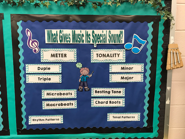
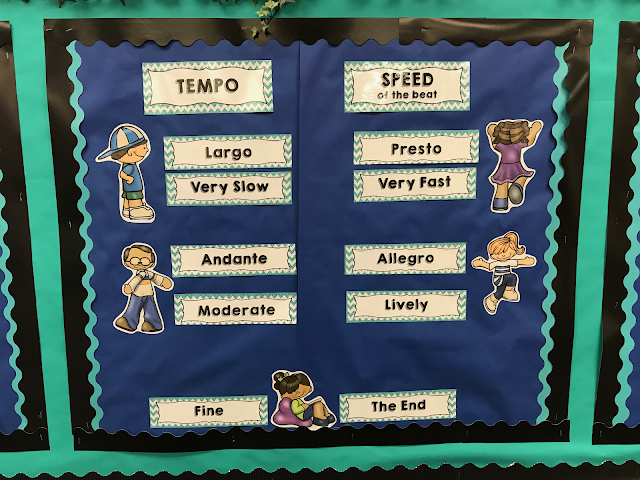
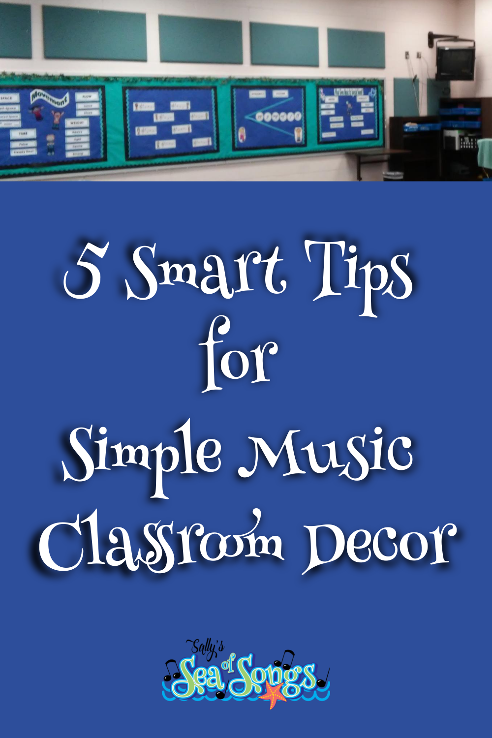
Here is a close-up view of two sections of my board that stay up all year long. As you can see in the photo above, I had a very long board that I wanted to divide into sections. The teal sound panels continue on every side of the room. Keeping with my school's expectations, I chose teal and blue as my two main colors, with black as my accent color. The teal serves as the background for the entire board and the blue designates the sections. If there had only been one small board, I would have probably skipped the teal background to get the most use of the smaller space for content.The content words are printed in color on regular printer paper. This gave me the teal border around each word. While there is a chevron pattern in the border, the same pattern is used on all words and there are no images in the pattern. Because I chose a pattern for the individual words, I definitely needed the solid color borders around the outside edges of the board.

Images can be fun, but I have to restrain myself to only those that help convey the message of the content. This is sometimes difficult!

Sally's Sea of Songs Classroom Decor
You can find these Word Wall Words cards and many other classroom content posters in my shop. I used the Glitter & Chevrons Music Decor set in my classroom.
I hope you have gained some ideas for making your music classroom the best learning environment for you and your students!
Musically Yours,


Reference:
Te first 2 links refer to Highly Effective Teaching.
https://www.edsurge.com/news/2016-03-01-10-tips-for-using-brain-based-methods-to-redesign-your-classroom
https://lakesidelink.com/blog/10-tips-for-using-brain-based-methods-to-redesign-your-classroom/
This study addresses the visual environment in classrooms. "When visual stimulation of the surrounding environment affects children's cognitive performance." https://www.sciencedirect.com/science/article/abs/pii/S0022096518300390
This article points to several research studies on visual environments: https://www.edutopia.org/article/dos-and-donts-classroom-decorations


.png)


0 Comments:
Post a Comment